18 Wedding Colour Palette Ideas for Indian Weddings 2026
- Why your colour palette is the first decision, not the last
- Soft and romantic palettes
- Regal and jewel-toned palettes
- Vibrant and festive palettes
- Modern and understated palettes
- Carrying your palette across outfits and stationery
- How to choose your wedding colour palette
- Related inspiration
- Frequently Asked Questions
- Sources and further reading
Your colour palette is the single decision that ties every function together, from the mehendi canopy to the reception stage. This guide walks through 18 curated wedding colour palettes for 2026, grouped by mood and season, with notes on how to carry each one across decor, lehengas, sherwanis, invitations and tablescapes.
Why your colour palette is the first decision, not the last
Before the venue is booked and long before the first tasting, the couples we plan for at Velvet Knot are quietly deciding one thing: how their wedding should feel. Colour is the answer to that question. A palette is not a pair of shades pinned to a moodboard. It is the thread that runs through the invitation that lands on a guest’s desk, the mandap your family gathers under, the lehenga in every photograph, and the tablescape at the reception dinner. Get it right and every element looks intentional. Get it wrong and even a lavish budget reads as scattered.
For a luxury Indian wedding spanning three to five functions, we usually build a core palette of two to three anchor colours plus one metallic, then flex the intensity across events. A soft daytime haldi and a candlelit reception can share a family of tones while feeling worlds apart. The 18 palettes below are organised by mood and season so you can find the register that suits your celebration, then read exactly how to translate it into decor, outfits, stationery and the table.
Soft and romantic palettes
These palettes suit daytime functions, garden mandaps, intimate pheras and brides who want a dreamy, editorial softness rather than heavy saturation. They photograph beautifully in natural light and pair well with sheer drapes, fresh florals and candlelight.
Blush and gold. The eternal romantic. Powder-pink drapes, blush roses and warm gold accents feel tender yet regal, ideal for a morning phera or an engagement. Dress the bride in a blush lehenga with gold zardozi and the groom in an ivory sherwani with a gold buti. Carry the blush into deckle-edge invitations with gold foil and a tablescape of dusty-pink linen, gold chargers and garden roses.
Ivory and sage. Understated and very 2026. Ivory drapes with sage-green foliage read fresh and expensive, perfect for a spring or monsoon garden wedding. Think olive-leaf runners, white orchids and a groom in an ivory bandhgala. It flatters a mandap dressed largely in greenery, which our wedding decoration guide covers in detail.
Peach and mint. A cheerful daytime pairing for haldi or a brunch reception. Peach marigolds against mint drapes feel sunny without shouting. Style bridesmaids in mint and the bride in a peach organza lehenga.
Lavender and grey. Cool, modern and quietly luxurious. Lavender blooms with soft grey linen suit a covered lawn or a monsoon evening. It is a striking, non-traditional choice for a sangeet stage.
Regal and jewel-toned palettes
When the brief is opulence, jewel tones deliver. These palettes are built for evening functions, grand ballrooms, palace venues and heirloom jewellery. They hold their own under chandeliers and reward heavy metallics.
Royal blue and silver. Commanding and contemporary. Sapphire drapes with silver mirror-work and crystal create a cool, glamorous reception. A royal-blue sherwani with silver embroidery is a genuine head-turner, and the palette photographs superbly at night.
Emerald and gold. Perhaps the most requested luxury palette of the year. Deep emerald velvet, gold candelabra and amber lighting feel like old-world royalty. An emerald lehenga with antique gold is timeless. Bring emerald into the invitation suite with gold foil for immediate impact.
Burgundy and rose gold. Warm, romantic and flattering to almost every skin tone. Burgundy drapes with rose-gold accents and blush florals suit a winter reception beautifully. Ideal for couples who want richness without going fully traditional red.
Deep red and ivory. The classic South Indian and North Indian wedding register, refined. Crimson and ivory with gold temple detailing honour tradition while staying elegant. This is the palette we most often pair with a traditional red bridal lehenga, and it helps to know the bridal lehenga cost before you commit to heavy zardozi.
Vibrant and festive palettes
For sangeets, mehendis and couples who love unapologetic colour, these high-energy palettes bring the joy. They suit daytime and early-evening functions, open-air venues and lively, dance-forward celebrations.
Coral and teal. A fresh, coastal-feeling contrast that lifts any mehendi. Coral marigolds against teal drapes are vivid without clashing. Perfect for a beach or poolside function.
Mustard and maroon (Rajasthani). Warm, earthy and rooted in heritage. Mustard drapes, maroon accents, marigold garlands and mirror-work evoke a Rajasthani haldi or a folk sangeet. Gota-patti detailing on the outfits completes the story.
Fuchsia and orange. Bold, festive and made for celebration. This punchy pairing sings on a sangeet stage and in bright daylight. Use it generously on florals and drapes, and echo it in a fuchsia lehenga for a fearless bride. It also inspires some of the boldest wedding stage decoration ideas we design.
Pastel rainbow. A modern multi-colour approach where blush, mint, peach, lavender and butter-yellow blooms mingle. Soft yet festive, it suits a whimsical mehendi or a daytime garden reception and is very photogenic.
Modern and understated palettes
For couples drawn to restraint, editorial minimalism and a fashion-forward look, these palettes prove that luxury can whisper. They suit contemporary venues, black-tie receptions and design-led celebrations.
Monochrome white and green. All-white florals, crisp linen and abundant greenery create a serene, high-end look that never dates. It photographs like a magazine spread and works for a sophisticated cocktail reception. A white or ivory sherwani keeps the groom in step.
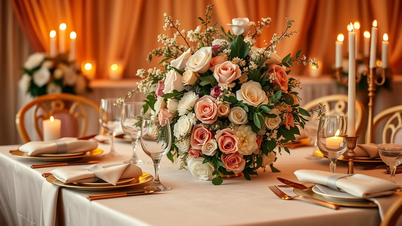
Champagne and dusty rose. Soft, glamorous and grown-up. Champagne satin with dusty-rose florals feels like understated couture, ideal for an evening reception. Metallic champagne chargers and blush glassware finish the table.
Black-tie and gold. Dramatic and unmistakably luxe. Deep black drapes with gold candlelight and white florals create a striking, modern reception. A black bandhgala with subtle gold detail is sharp and confident. Reserve this register for the reception rather than the ceremony.
Whichever modern palette you choose, the mandap and stage carry the most visual weight, so it is worth exploring focused mandap decoration ideas early in the planning.
Carrying your palette across outfits and stationery
A palette only feels expensive when it repeats with discipline. Start with the invitation, because it sets the guest’s first impression weeks before the wedding. Match the foil and envelope liner to your anchor colours, and if you are pricing bespoke stationery, our note on wedding invitation cost helps set expectations for foil, laser-cut and box invites.
For outfits, the couple should sit within the palette without being an exact swatch match to the decor, which looks flat in photos. If the mandap is emerald and gold, an emerald lehenga with antique-gold work harmonises, while the groom can wear ivory or a deeper bottle-green to add dimension. Sherwani colour is a real budget lever, so it is useful to understand the groom sherwani cost for hand-embroidered versus machine work before finalising the shade.
Carry the palette to the table last: linen, napkins, chargers, glassware, menu cards and floral centrepieces should all draw from the same three or four colours. When stationery, outfits, mandap and tablescape sing in unison, the whole wedding reads as one considered world rather than a series of separate events.
How to choose your wedding colour palette
By venue. Let the space lead. A heritage palace or a room with strong existing colour wants a palette that complements its architecture, not one that fights it. A blank banquet hall gives you a clean canvas for bolder choices, while a garden already brings green, so lean into ivory, blush or white.
By season. Soft pastels and fresh greens feel right for spring and monsoon daytime functions. Jewel tones, burgundy and champagne come into their own for winter evenings, when candlelight deepens every shade. Summer suits crisp whites and citrus brights that stay fresh in the heat.
By skin tone. This matters most for the couple’s outfits. Warm undertones glow in gold, coral, emerald and mustard. Cool undertones are flattered by royal blue, lavender, silver and burgundy. When unsure, jewel tones are universally kind on camera.
By function. Flex the intensity across events rather than repeating one palette identically. A pastel haldi, a vibrant mehendi, a jewel-toned wedding and a champagne reception can all belong to one family if you keep a consistent metallic and one recurring accent colour. That single thread is what makes a multi-day celebration feel curated from start to finish.
Planning a luxury wedding?
Tell us your dates and vision. Team Velvet Knot will put together a tailored plan and an honest budget.
Related inspiration
Frequently Asked Questions
What are the most popular wedding colour palettes for 2026?
Emerald and gold, blush and gold, and champagne and dusty rose lead the luxury requests for 2026. Jewel tones dominate evening receptions, while soft ivory-and-sage and monochrome white-and-green palettes are rising fast among couples who want an understated, editorial look.
How many colours should an Indian wedding palette have?
Two to three anchor colours plus one metallic is the sweet spot. Fewer looks flat across multiple functions, and more becomes hard to control. Keep one recurring accent and one consistent metallic across all events so the whole celebration feels connected.
Can I use different colours for each wedding function?
Yes, and the best multi-day weddings do exactly this. Flex the intensity per event, for example a pastel haldi, a vibrant mehendi and a jewel-toned reception, but hold one metallic and one accent colour constant throughout so the events still read as one story.
Which wedding colour palette photographs best?
Jewel tones such as emerald, royal blue and burgundy hold beautifully under evening light and chandeliers. For daytime, blush and gold and ivory and sage read soft and expensive in natural light. Monochrome white and green looks especially crisp on camera.
Should the bride’s lehenga match the decor exactly?
No. The bride should sit within the palette but not be an exact swatch match, which looks flat in photographs. If the mandap is emerald and gold, an emerald lehenga with antique-gold work harmonises while the groom can wear a contrasting ivory or bottle-green to add depth.
How do I choose a palette for a winter versus summer wedding?
Winter evenings suit deep jewel tones, burgundy and champagne, which glow under candlelight. Summer and daytime functions call for crisp whites, pastels and citrus brights that stay fresh in the heat. Always let the venue and season guide the base before adding accents.
Sources and further reading
Begin Your Engagement
Want a real number for your wedding?
Tell us your city, guest count and dates. Team Velvet Knot will come back within 24 hours with an itemised budget.